Data is everywhere, but its true value lies in how we interpret and act on it. By combining visuals, narratives, and actionable insights, data storytelling transforms complex datasets into compelling stories that drive decision-making. Whether you’re a business analyst, marketer, or data scientist, mastering this skill can bridge the gap between insight and action.
What is Data Storytelling?
Defining Data Storytelling
At its core, data storytelling is the art of presenting data in a way that informs, inspires, and motivates action. Unlike traditional reporting, which often focuses solely on numbers, data storytelling blends:
- Data: The raw insights derived from analytics.
- Narrative: The context that explains the data.
- Visuals: Charts, graphs, or infographics that enhance understanding.
Why is Data Storytelling Important?
In a world overflowing with information, stories cut through the noise. Studies suggest that people are 22 times more likely to remember a fact when it’s wrapped in a story. For businesses, this means better communication, alignment, and faster decision-making.
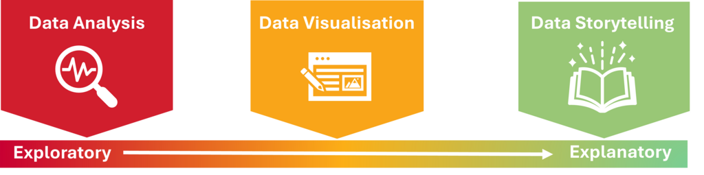
The Spectrum: From Data Analysis to Storytelling
Data exploration, analysis, visualisation, and storytelling exist along a natural progression on a spectrum. As you move from left to right, the data becomes more refined and the insights more actionable.
Data Analysis (Exploratory)
At the exploratory end of the spectrum, data analysis begins. This phase is all about diving into raw data to identify trends, patterns, or outliers. It’s typically a broad examination of the data with little context, often using tools like statistical tests, correlation matrices, or exploratory data analysis (EDA) techniques. The goal here is to get a general sense of the data and formulate questions that could lead to insights. It is often unstructured and open-ended.
Data Visualisation (Middle of the Spectrum)
As you progress along the spectrum, you move toward data visualisation. This phase helps make sense of the findings from the exploration stage by transforming data into charts, graphs, and interactive elements. Visualisation bridges the gap between raw data and interpretation, turning abstract figures into something more digestible and intuitive. It’s where you begin to tell a more structured story but still rely on visuals to convey meaning. The goal here is clarity—making the data accessible while highlighting key trends and patterns.
Data Storytelling (Explanatory)
Finally, at the explanatory end, you reach data storytelling. This is where you communicate the insights in a narrative format, giving context and meaning to the visualisations and findings from earlier stages. Data storytelling weaves together visuals, data, and context into a cohesive narrative that guides the audience from problem identification through to actionable insights. It’s about explaining why the data matters and what steps should be taken based on it. In this phase, the data becomes more than just numbers—it becomes a story that inspires action.
Steps to Mastering Data Storytelling
1. Understand Your Audience
The first rule of storytelling is to know who you’re speaking to. Are you addressing technical stakeholders or a non-technical team? Tailor your story to their level of understanding, focusing on the metrics and narratives that matter most to them.
2. Start with a Clear Objective
At its core, data storytelling is the art of presenting data in a way that informs, inspires, and motivates action. Unlike traditional reporting, which often focuses solely on numbers, data storytelling blends:
- Data: The raw insights derived from analytics.
- Context: The background information that helps the audience understand why the data is important and how it applies to their situation.
- Narrative: The story that explains the data, providing a clear, engaging flow that ties together the key insights.
- Visuals: Charts, graphs, or infographics that enhance understanding and make the data more digestible.
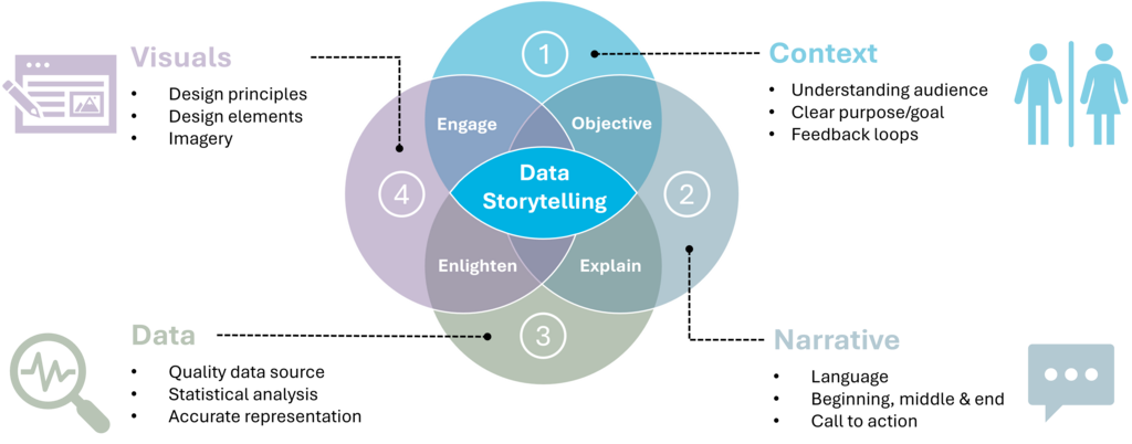
3. Structure Your Story Effectively
A strong narrative follows a simple structure:
- Beginning: Set the context and introduce the challenge.
- Middle: Present the data and key insights.
- End: Offer actionable recommendations or solutions.

Choose the Right Visuals
Visualisation is a cornerstone of data storytelling, as it turns complex data into accessible, digestible formats. The right visual can make patterns and trends immediately apparent, while the wrong choice can leave your audience confused or disengaged. The key to effective data storytelling is selecting the appropriate visualisation technique based on the data’s nature, the message you want to convey, and your audience’s needs.
Here are some guidelines to help you choose the best visual for your data:
1. Understand the Data Types and Goals
Consider the type of data you’re working with and the insight you want to communicate. Broadly, data can be classified as:
- Categorical (qualitative): Data that fits into distinct categories, such as types of products, regions, or customer segments.
- Numerical (quantitative): Data that involves numbers and measurements, such as sales revenue, temperature, or age.
Your goal will determine which type of visual is most effective. Are you trying to show the distribution of values? Compare categories? Or highlight trends over time? Understanding these goals is the first step in choosing the right visual.
2. Common Types of Visuals and When to Use Them
- Bar Charts
A bar chart is ideal for comparing categorical data, such as sales revenue by region or product popularity. - Line Graphs
Perfect for showing trends over time, such as tracking revenue or website traffic across months or years. - Pie Charts
Effective for showing proportions or percentages of a whole, but should be used sparingly and only when there are fewer than five categories. - Scatter Plots
Great for showing the relationship between two continuous variables, like advertising spend and sales performance. - Histograms
Used for visualising the distribution of a continuous variable, such as age ranges or income distribution. - Heatmaps
Helpful for displaying large datasets and showing patterns or density, often used in website click analysis. - Stacked Bar/Area Charts
These charts show how multiple components contribute to a whole, useful for showing category breakdowns over time. - Treemaps
Best for displaying hierarchical data, where you can compare proportions within categories and subcategories.
3. Keep It Simple and Clear
While it can be tempting to use flashy visuals, simplicity should always come first. A simple, well-chosen visual will often have more impact than a complex one. Stick to clear, intuitive visuals that are easy to interpret at a glance.
4. Use Colour Effectively
Colour is a powerful tool in data visualisation, but it should be used thoughtfully. Use contrasting colours to highlight key points, but avoid overwhelming your audience with too many colours. Also, ensure that your colour choices are accessible to everyone, including those with colour blindness. Use tools like ColorBrewer to choose colour schemes that work for different types of data.
5. Test for Audience Understanding
Before finalising your visuals, test them with your target audience. Gather feedback, ask colleagues or a test group to interpret the visual, and make any adjustments to improve clarity.
Real-World Examples of Data Storytelling in Action1. Google Search Trends: Making Global Data Relatable
Google’s Year in Search report is a masterclass in data storytelling. Each year, Google compiles billions of search queries into a cohesive narrative, reflecting the major events, trends, and emotions of the year.
👉 Explore the latest Year in Search report on the Google Trends Website.
2. Spotify Wrapped: Personalisation Through Storytelling
Spotify Wrapped is a personalised data storytelling experience that millions eagerly await each year. It transforms a user’s listening habits into an engaging, shareable story.
👉 Check out examples of Spotify Wrapped campaigns on Spotify Newsroom.
3. Charity Impact Reports: Driving Action with Transparency
Non-profit organisations like UNICEF use data storytelling in their annual reports to show donors the tangible impact of their contributions.
👉 View an example of UNICEF’s impact reports on their Annual Reports Page.
4. Netflix Recommendations: Data Storytelling Behind the Scenes
Netflix leverages data storytelling not only for internal decision-making but also as a subtle way to communicate the relevance of their recommendations to users.
👉 Learn more about how Netflix uses data in their Tech Blog.
5. Airbnb: Building Trust Through Data-Driven Stories
Airbnb uses data storytelling to build trust with hosts, guests, and stakeholders alike.
👉 Check out Airbnb’s official Newsroom for stories and insights.
6. Johns Hopkins COVID-19 Dashboard: Informing the World in Real Time
During the COVID-19 pandemic, the Johns Hopkins University dashboard became one of the most widely cited resources globally.
👉 Explore the Johns Hopkins COVID-19 Dashboard.
7. LinkedIn’s Workforce Reports: Insights for Professionals
LinkedIn regularly publishes workforce reports that highlight employment trends, in-demand skills, and emerging job markets based on user data.
👉 Read LinkedIn’s latest Workforce Insights.
Conclusion
In today’s data-driven world, insights alone are not enough; their value lies in how effectively they lead to action. By mastering the art of data storytelling, you can turn numbers into narratives, inspire decisions, and drive meaningful outcomes.